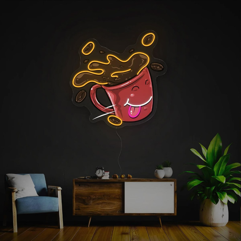
A business space should do more than provide a place for customers to enter, shop, eat, or relax. It should create an atmosphere that people remember. Lighting plays a major role in that experience, and neon has become one of the most recognizable ways to add personality to an interior or exterior.
From restaurants and salons to retail stores and home offices, businesses are using personalized lighting to communicate their identity. A carefully designed sign can become part of the décor while also helping customers recognize a location from a distance.
Why Lighting Matters in Business Design
When someone walks into a business, the environment can influence how they feel about the brand. Bright lighting can create energy, while softer illumination can make a room feel more comfortable. Neon offers another option because it combines illumination with visual identity.
Unlike ordinary overhead fixtures, a neon sign can become a focal point. A short phrase, company name, logo, or symbol can immediately draw attention to a particular wall or display area.
This is especially useful for businesses that depend on visual presentation. Customers often take photographs in attractive spaces and share them on social media. A distinctive illuminated feature can therefore become part of the customer experience rather than simply serving as a decorative object.
Designing a Sign Around Your Brand
One of the biggest advantages of personalized signage is the ability to choose an appearance that fits an existing brand. Before selecting a design, I would consider the business's colors, typography, target audience, and overall atmosphere.
For example, a modern clothing boutique may benefit from clean lettering and a simple shape. A restaurant might choose a playful phrase or illustrated symbol. A beauty salon could use elegant lettering that complements its interior.
When exploring custom neon signs, I would also think about where the sign will be installed. A design that looks excellent above a reception desk may not work equally well on a large exterior wall.
Size matters too. A small sign can get lost in a large room, while an oversized design may overwhelm a compact space. Taking measurements before ordering makes it easier to select proportions that feel balanced.
Choosing the Right Message
A sign does not always need to display the full business name. Sometimes a short phrase can have a stronger visual impact.
Words connected to the company's personality can create an inviting environment. A coffee shop might use a phrase related to morning routines, while a fitness studio could display an encouraging message. A creative agency might choose something humorous or unexpected.
The key is keeping the message easy to understand. If customers need several seconds to figure out what a sign says, the design may be too complicated.
I also prefer messages that can remain relevant for a long period. Seasonal phrases can be fun, but a permanent installation generally benefits from wording that will not become outdated after a few months.
Selecting Colors That Work With the Interior
Color is one of the most noticeable characteristics of illuminated signage. The right shade can complement furniture, walls, artwork, and other decorative elements.
A business with neutral walls has considerable flexibility. A vivid sign can introduce a strong accent without competing with existing colors. In a colorful environment, however, a simpler lighting choice may produce a cleaner result.
Brand consistency is another consideration. If a company already uses specific colors in its logo, packaging, website, or uniforms, incorporating related tones into its signage can make the entire space feel more cohesive.
That does not mean every element has to match perfectly. Sometimes contrast produces a more interesting result. The goal is to make the sign feel like a deliberate part of the environment.
Where a Neon Sign Can Make the Biggest Impact
Placement can be just as important as the design itself. A beautiful sign positioned where nobody notices it will not achieve much.
Reception areas are popular because visitors naturally look toward the desk when entering. A company name or logo behind the reception counter can reinforce brand recognition immediately.
Photo walls are another useful location. Restaurants, salons, hotels, and retail businesses can create a dedicated backdrop where visitors are encouraged to take pictures. A memorable sign can make the location recognizable when those images appear on social platforms.
Windows can also provide an opportunity for illuminated branding. A sign facing the street can attract attention after sunset and help people identify a business from outside.
For home-based businesses or studios, a smaller sign can add character to a workspace without requiring a complete redesign.
Thinking About Visibility
Visibility should be considered from the perspective of the person who will see the sign. A sign placed at eye level creates a different impression from one installed several feet above the floor.
I would stand at different points around the room before deciding where to mount the sign. This simple exercise can reveal whether furniture, shelving, plants, or other décor will block it.
Outdoor placement requires additional consideration. The sign needs to remain visible from the direction customers approach. If a storefront is located along a busy road, larger lettering may be more effective than a detailed illustration.
For indoor signs, ambient lighting should also be considered. A bright sign against strong daylight may look different during evening hours. Checking the space at different times can help determine the best location.
Creating a Social Media Friendly Space
Modern customers often document their experiences through photographs and short videos. Businesses can take advantage of this behavior by designing areas that naturally encourage sharing.
A distinctive neon feature can provide an obvious photo opportunity. However, the surrounding area matters too. A clean wall, attractive furniture, suitable flooring, and thoughtful decoration can make the entire scene more appealing.
I would avoid filling the background with too many competing elements. When the sign is the primary visual feature, photographs tend to look cleaner and the brand message becomes easier to recognize.
Adding the business name or a memorable phrase can also help when images are shared online. Even if someone discovers the photograph outside the business's own marketing channels, the sign can provide immediate brand recognition.
Considering Quality and Maintenance
Before choosing signage, it is worth thinking about durability and maintenance. A business sign may remain in place for years, so construction quality should be considered alongside appearance.
The installation area should be clean and suitable for mounting. Electrical requirements should also be reviewed in advance, particularly when the sign will be installed in a commercial environment.
Dust can accumulate around illuminated features just as it does around other decorative objects. Regular cleaning helps maintain a polished appearance. I would follow the manufacturer's cleaning and installation recommendations rather than using aggressive products that could damage the materials.
A properly planned installation can reduce the likelihood of needing adjustments later.
Matching the Sign to the Customer Experience
The strongest business interiors usually have a consistent theme. Signage should support that theme rather than feel like something added at the last minute.
For example, a sophisticated restaurant may benefit from refined lettering and understated illumination. A youthful entertainment venue can take a more energetic approach. A professional office might use a simple logo or company name instead of a playful slogan.
Understanding the intended customer is therefore essential. The same design can feel appropriate in one environment and completely out of place in another.
I would ask a simple question before committing to a design: does this sign look like something my customers would associate with my brand?
If the answer is yes, the design is probably heading in the right direction.
Using Neon as Part of a Larger Design Strategy
Neon should not be viewed as a replacement for good interior design. It works best when it complements the rest of the space.
Furniture, wall finishes, plants, artwork, signage, and lighting should work together. A carefully selected sign can then serve as an accent that pulls these elements together.
Brands such as Miami Neons demonstrate how personalized illuminated signage can be approached as both branding and décor. The important part is selecting a concept that fits the business rather than choosing a design simply because it looks impressive on its own.
A thoughtful sign can help establish a recognizable atmosphere, create a stronger first impression, and give customers another reason to remember a location.
Conclusion
Good business design is about creating an environment that communicates something before a customer even speaks with an employee. Lighting is one of the easiest ways to influence that first impression, and personalized neon can add both personality and practical visibility.
From selecting the right message to choosing colors, placement, size, and surrounding décor, every decision contributes to the final result. When the sign reflects the brand and fits naturally into the environment, it becomes more than a light on the wall. It becomes part of the identity customers remember.