Start With a Clean PSD
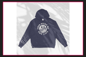
Before you touch shadows or texture, set your PSD up for control. Open the mockup and locate the Smart Object layers (usually labeled “Your Design Here”). Double-click the Smart Object, paste your artwork, save, and close. Now your design is in place, and you can judge lighting and surface detail accurately. Grab a professional mockup PSD —visit the website https://mock-it.co for quick downloads and updates.
Adjust Highlights Without Washing Out Detail
Most quality mockups separate lighting into highlight layers. These are often set to Screen, Linear Dodge, or Overlay. Start by lowering the opacity until the shine looks natural on the garment. If the highlight is too strong in one area, add a layer mask and gently brush out the excess with a soft brush at low flow. This keeps the fabric realistic while preventing “plastic” brightness.
Shape Shadows for Depth and Fit
Shadows sell the fit of apparel. Look for shadow layers set to Multiply. Instead of darkening everything, control where shadows fall. Use a mask to deepen folds near seams, under sleeves, and along the hem. If the mockup includes separate “wrinkle” or “crease” layers, keep them visible and tune the opacity rather than repainting from scratch. When shadows are correct, the design appears printed on the garment, not floating above it.
Add Texture Without Making It Look Noisy
Textures should support fabric grain, not compete with the artwork. Many PSDs include a “Texture” or “Fabric” layer on Overlay or Soft Light. If your design looks too sharp, clip a subtle texture layer above the artwork and set it to Soft Light, then reduce opacity. For stronger fabric interaction, try Blend If in Layer Styles to let texture affect only midtones and avoid crushing whites and blacks. This is especially useful for heather tees, embroidery-style effects, and worn-in looks. Download a high-quality t shirt mockup —visit the website to view options and formats.
Keep Everything Consistent Across Colorways
When you change shirt colors, lighting can shift. Use adjustment layers (Curves, Levels) above your design but below lighting effects, so highlights and shadows stay consistent. Save versions per colorway and reuse the same opacity and mask logic to maintain a uniform product presentation.
Author Resource:-
Elmon advises people about fashion, clothing and t shirts mockup.